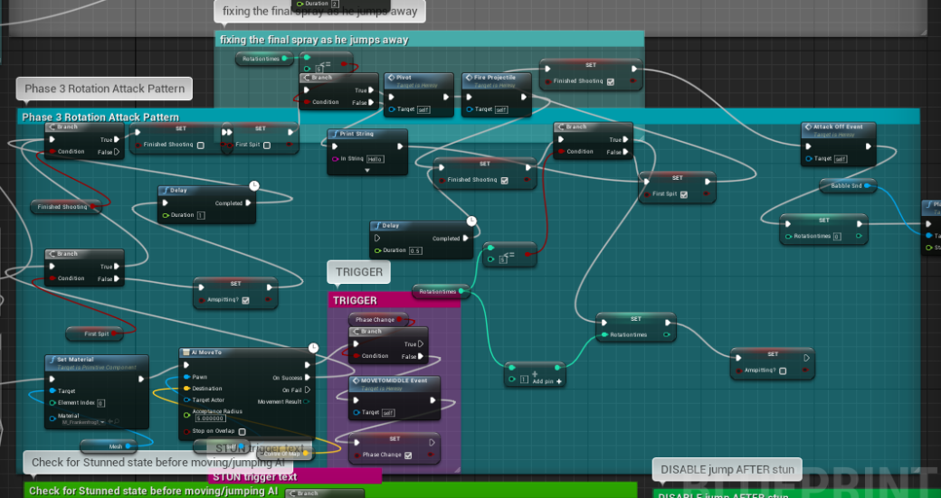
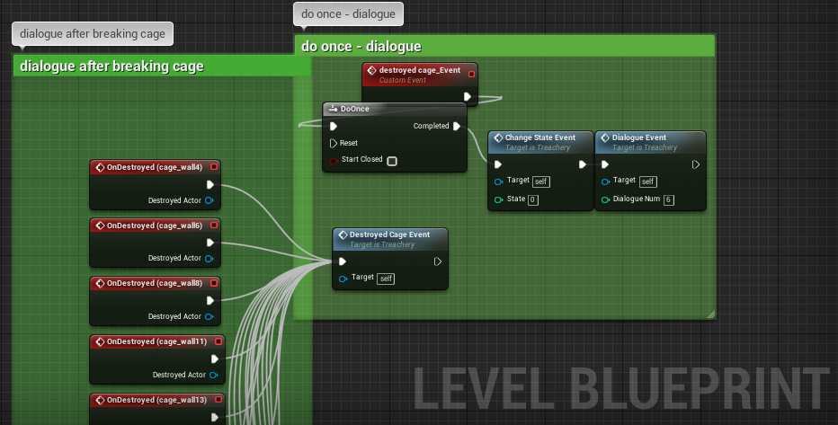
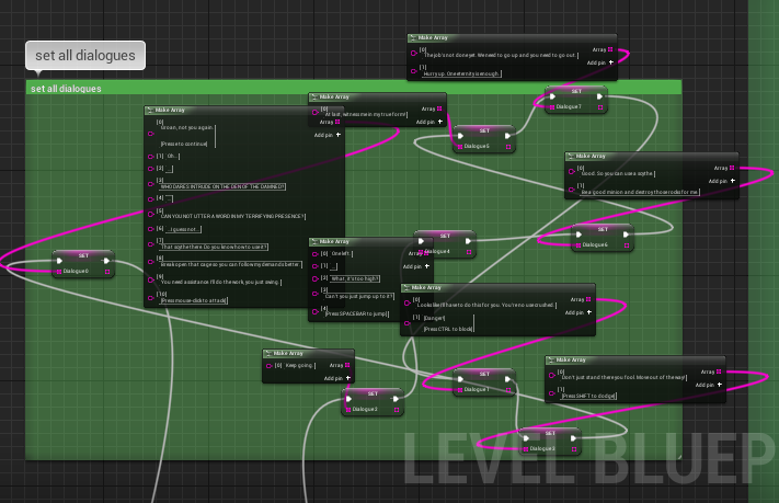
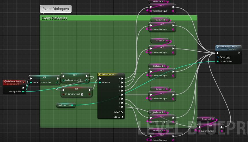
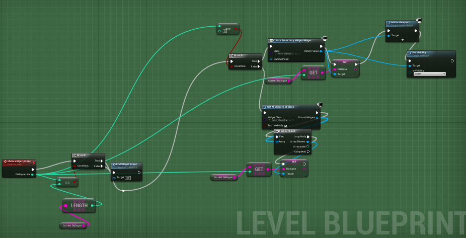
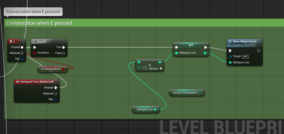
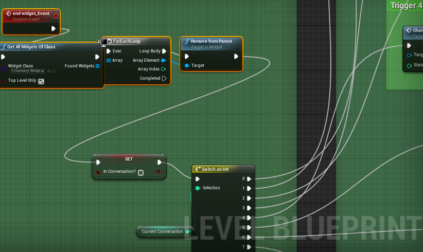
Treachery
-
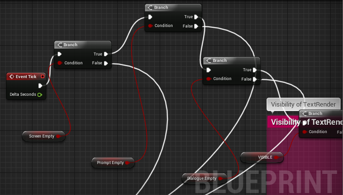
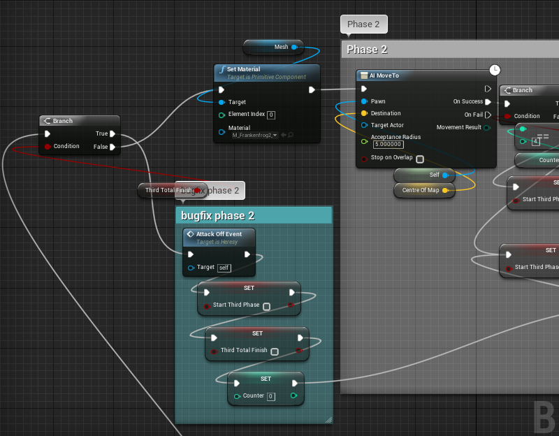
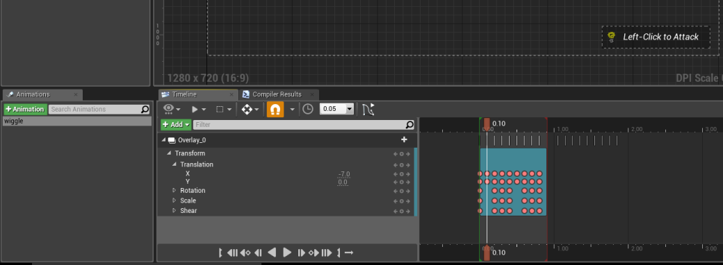
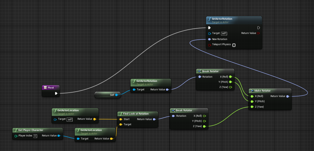
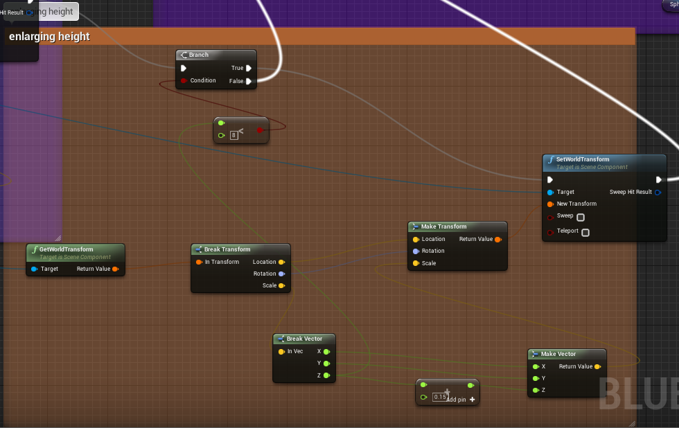
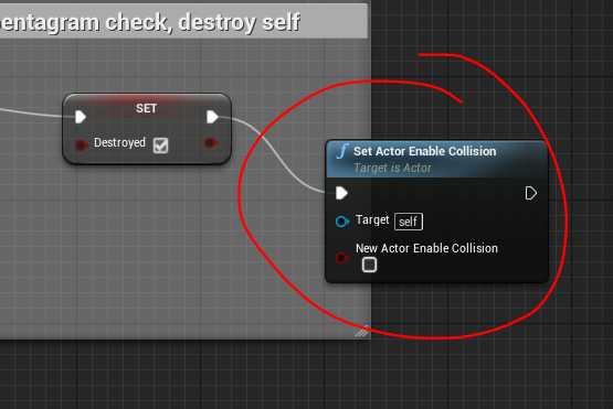
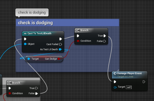
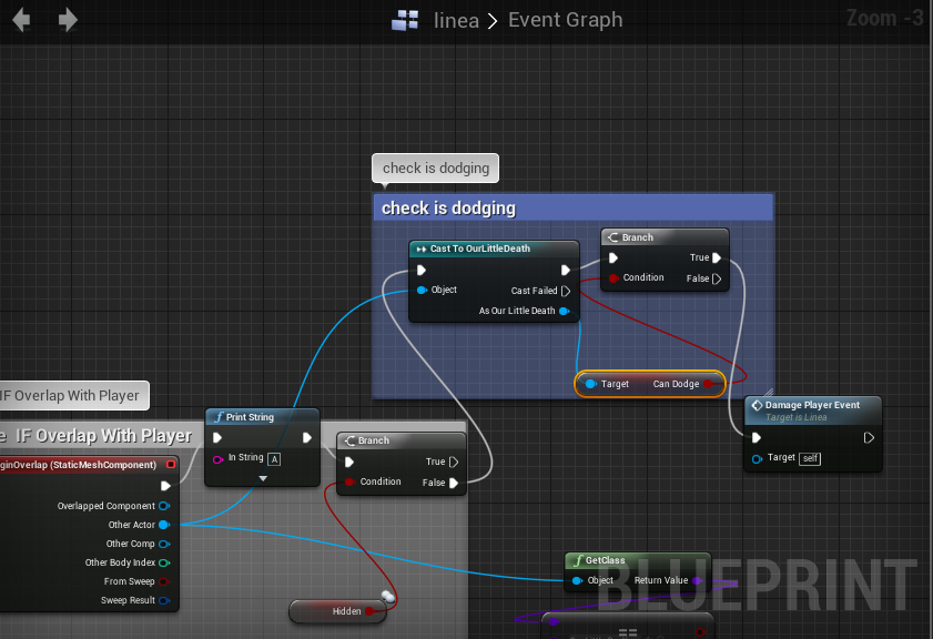
[Bugfixing] Rolling over lines
This was a bug that had given me some trouble, especially seeing as I didn’t want to have to further edit or add to the player blueprint.
I was able to recreate a similar effect by creating a check against the boolean variable ‘can roll’ in a reverse-logic kind of way. If the player ‘can dodge’, then he is not dodging at that moment – thus, ‘is rolling’ becomes false. If the player is unable to dodge then he is dodging at that moment.
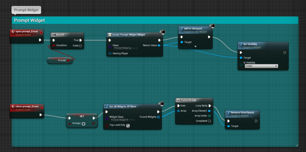
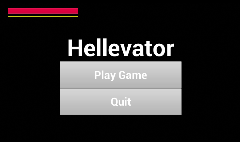
Menus
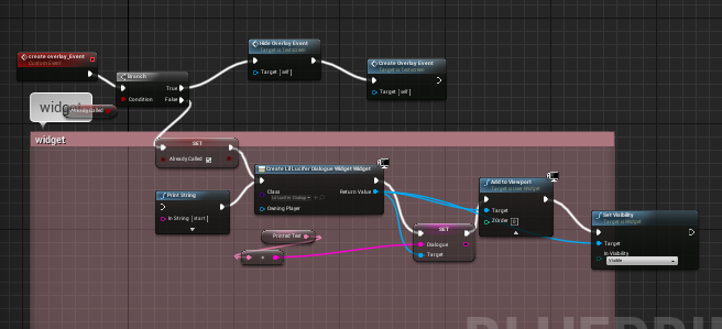
Our producer wanted to remove the player character model from the main menu. I could not find code referring to or casting as the player character so I had to do some digging. Eventually I found that the main menu was an overlay on an ’empty’ level – removing the instance of the player character from this physical level solved the problem.
Fixed menu:
-
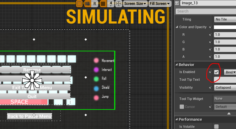
Controls menu (keymapping picture)
Firstly, I created a keyboard map in photoshop that illustrated the key bindings for our game:
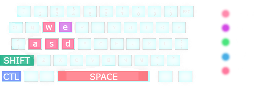
I then added the file to the game files and imported is as a texture onto an image in the menu widget.
To control the menu screen navigation, I used Blueprints.
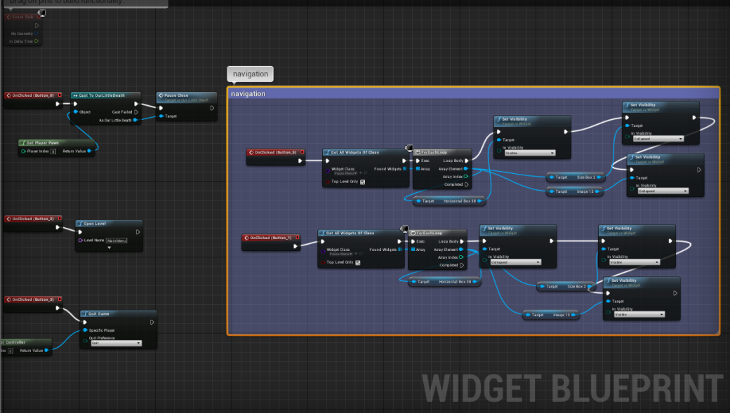
Finished product:
-
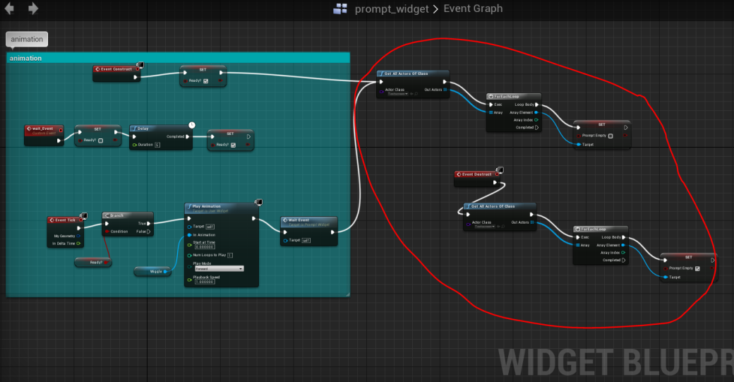
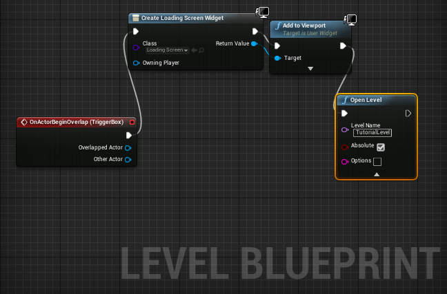
[Bugfixing] Loading Screens
I ensured that the loading screen displayed for all levels after exiting the Hellevator (there are currently 3 instances of the Hellvator level):
Research on menus and widgets:
https://answers.unrealengine.com/questions/591019/how-to-set-widget-component-visibility-to-use-widg.html
https://answers.unrealengine.com/questions/365455/when-adding-objects-they-turn-gray.html
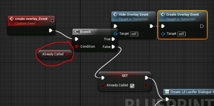
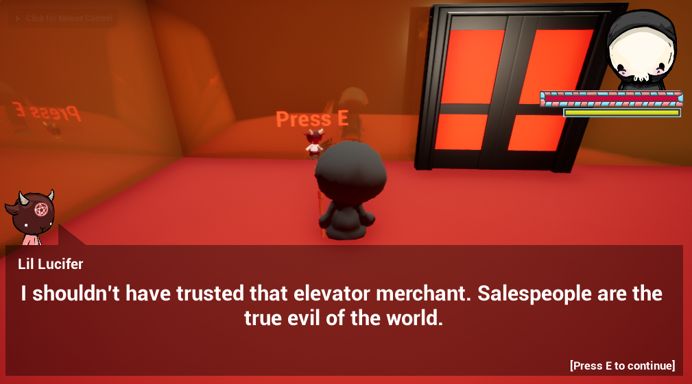
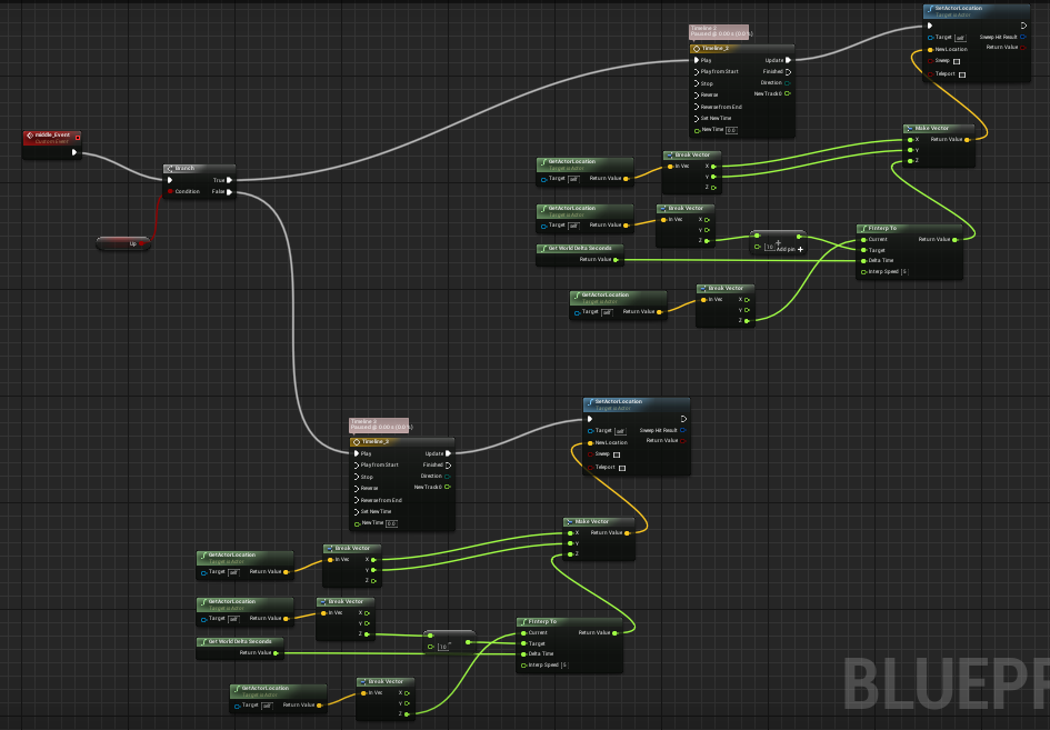
Hellevator
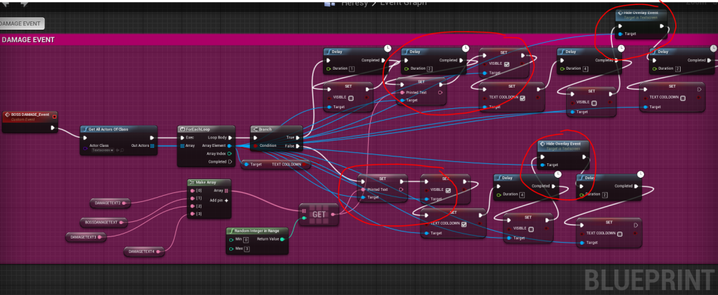
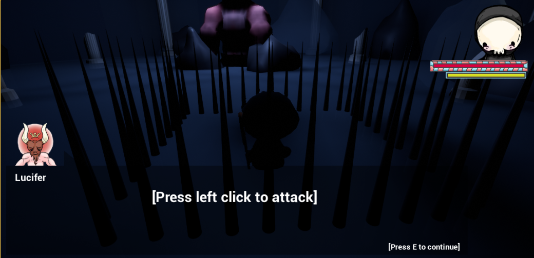
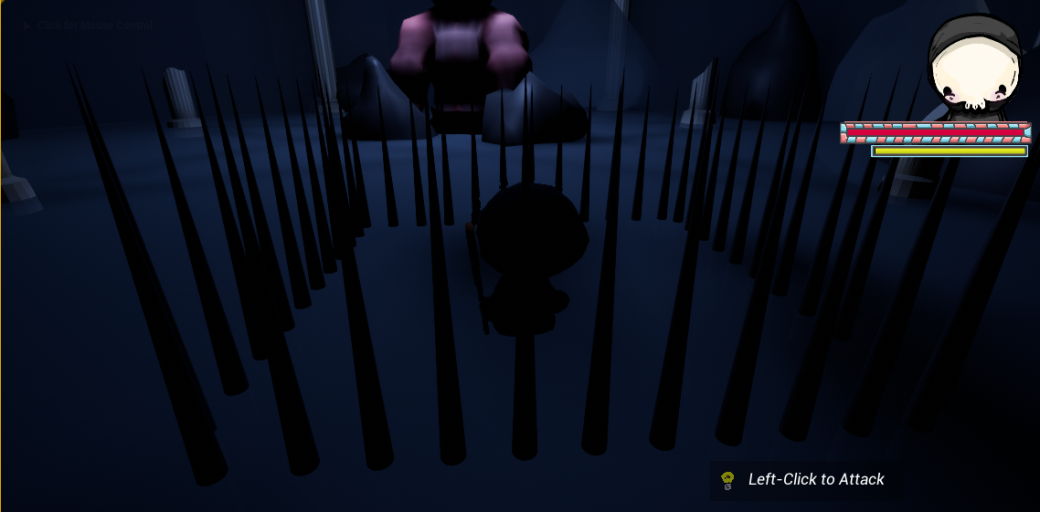
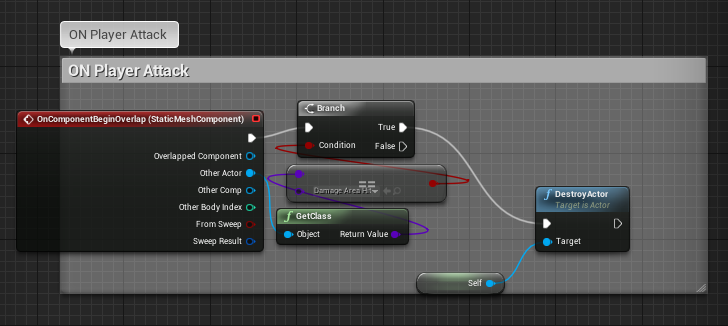
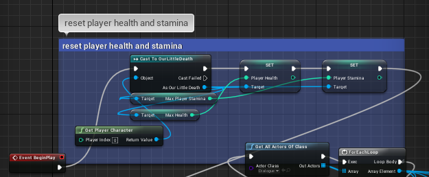
- [Bugfixing] Lil Death’s health, stamina bars
In the same level blueprints, I created code to reset the player’s health and stamina to their maximum value.
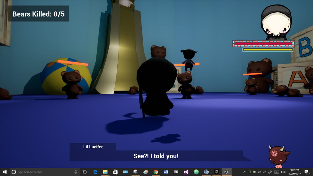
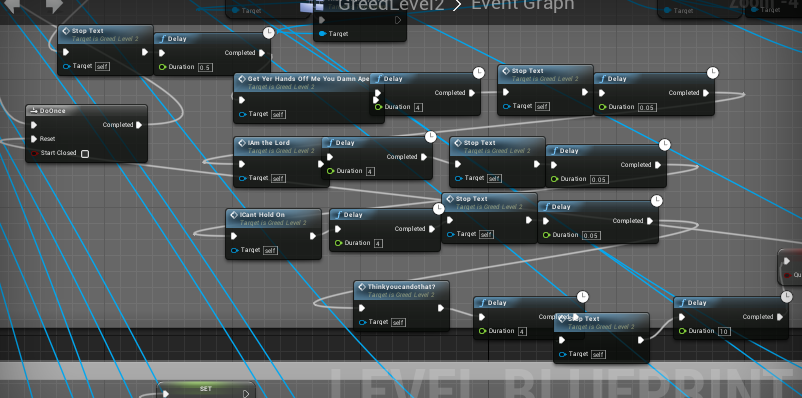
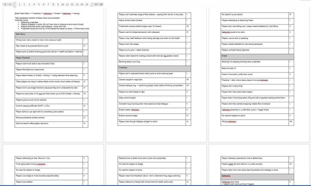
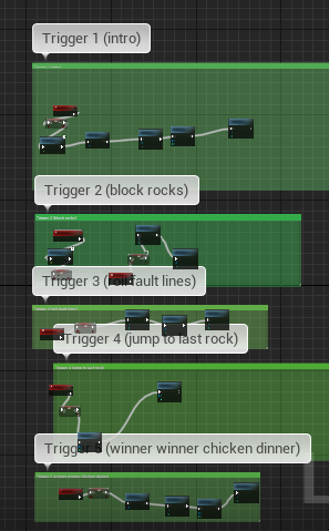
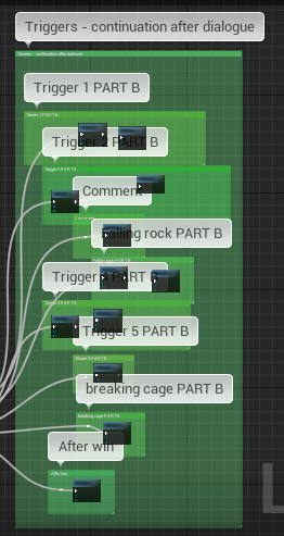
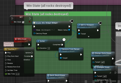
Greed
For Greed, I was tasked with creating level cohesion and flow. To do this, I began by researching how game developers design signposting in their games to deliver a sense of progression and reward to their players.
After my research, I felt that persistent visual cues that reacted directly to the state of play were the most effective way to signpost level progression for the player.
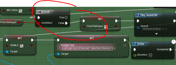
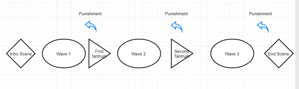
I implemented this research in the following sequence plan that I designed to mimic the format of blueprints code:
ENTER LEVEL [GREED]:
Freeze player
[INTRO SCENE]
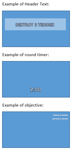
Display Header Text: Defeat 3 enemies
~..*..ROUND 1..*..~
ON TEXT FADE: (round 1 start)
Unfreeze player
Start round timer
Display round timer on screen
Display objective on screen
ON ROUND COMPLETE:
Trigger 5 second breather
~..*..ROUND 2..*..~
ON TIMER END– (round 2 start)
Display Header Text: Defeat 3 enemies
ON TEXT FADE:
Start round timer
Display round timer on screen
Display objective on screen
ON ROUND COMPLETE:
Trigger 5 second breather
~..*..ROUND 3..*..~
ON TIMER END– (round 3 start)
Display Header Text: Defeat 3 enemies
ON TEXT FADE:
Start round timer
Display round timer on screen
Display objective on screen
ON ROUND COMPLETE:
*Baby screaming sfx*
Trigger short timer
~..*.END LEVEL..*..~
ON TIMER END
Freeze player
Camera pan to baby having tantrum
[END SCENE]
~..*.LOSE ROUND..*..~
ON PUNISHMENT ROUND:
*Baby laughing sfx*
Freeze player
Pan camera to baby
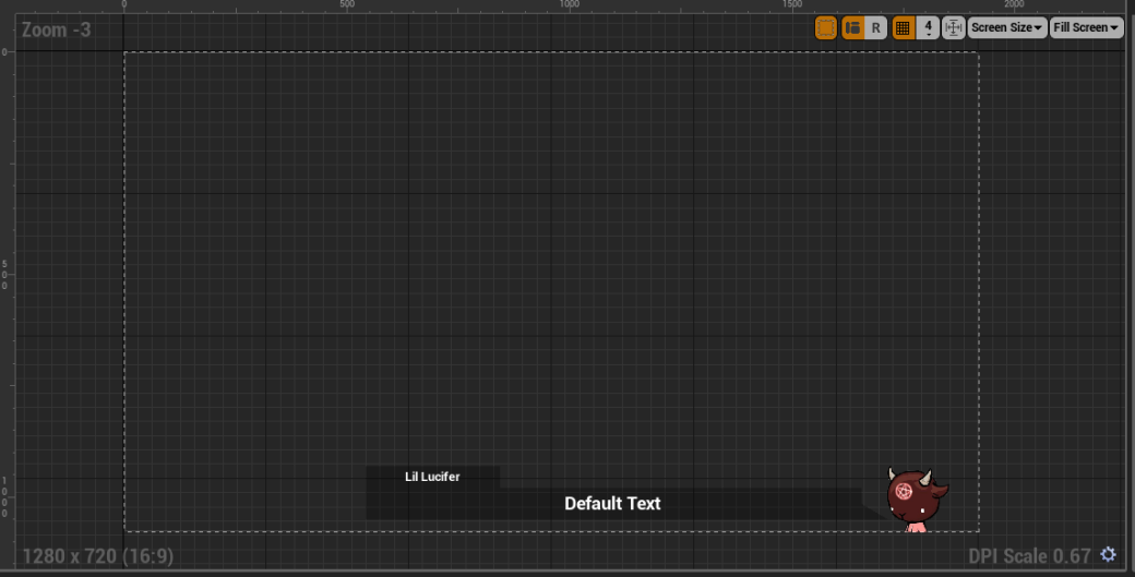
[Lil Lucifer is stolen in bubble]
Return camera to player
Unfreeze player
Start round timer
Display Header Text: “Survive till time runs out”
Display round timer on screen
ON TEXT FADE:
Display objective on screen
ON ROUND COMPLETE:
Lil Lucifer returned to player
Trigger 5 second breather
ON TIMER END – (round X start)
Research
Greed – Level Flow
This week I was tasked with creating ‘flow’ for Greed – creating direction in the gameplay and keeping the experience engaging for players. To achieve this, I wanted to understand flow in videogames and the ways in which players are affected by it. My goal is to be able to produce a mechanically superficial layer on top of the existing system to improve user experience but without touching any underlying mechanics.
Signposting
Greed Level Design – Flow Chart
 Credit: Bob Cuthbert
Feedback in the form of signposting is used to alert and update the player to the current state of the game in order to generate an exciting play where which the overall outcome remains uncertain till the very end.
The second use of feedback is positive or negative feedback, to reward or punish the player. Feedback can be used in this way to engage the player in the game by directly enticing them and rewarding engaged behaviour using ‘rewards’.
Although these ‘events’ and ‘triggers’ exist in the code, they are invisible to the users with feedback. Visual feedback should be used in parallel with changing game states to alert the player to the current state of the game and to provide reward to them through the GUI.
Flow Theory
Flow in videogames not only refers to game design, but also to the state of immersion.
When a player is completely immersed in a video game, they come across a phenomenon known as ‘flow’ – experienced as losing track of time and forgetting external pressures. The total immersion of ‘flow’ is valued by gamers to the point that most users will value or devalue difference games based on whether or not those games can provide immersive flow experiences.
Flow Theory
Conditions that must be fulfilled to enter ‘flow’ state;
- You must be performing a challenging activity that requires skill.
- The activity must provide clear goals and feedback.
- The outcome is uncertain but can be influenced by your actions.
Other prominent effects of being in the ‘flow-state’ include:
- Concentration on immediate tasks: complete focus.
- Distorted sense of time
Learning a new skill – by being given a challenge that forces you to try hard and increase your skill level – is one of the prerequisites for putting players in a flow state.
Take-home Notes
- For the player to feel progression they may need visual cues and reminders [flow theory – clear goals]
- Effective flow immersion creates a distorted sense of time – thus any countdown timers must be displayed on screen for a visual cue of time with the potential to further create audio cues. [flow theory – distorted time]
- External objectives and changing game states must be tracked for the player as flow immersion created a consuming-concentration on the immediate tasks (and not on tracking objectives). [flow theory – concentration]
- Players should be reminded of all win-conditions and lose-conditions so they don’t feel cheated by the game if either one takes them by surprise [flow theory – clear goals]
- Players need immediate feedback for their decisions, such as a visual cue updating on screen, else game progression cannot be felt [flow theory – feedback]
- Introducing new challenges or mechanics engages the player and increases flow [flow theory – learning a new skill]
References:
https://gamedesignconcepts.wordpress.com/2009/07/20/level-7-decision-making-and-flow-theory/
Click to access Flow_in_games_final.pdf
http://www.randygaul.net/2010/05/10/game-design-positive-and-negative-feedback-flow-control/
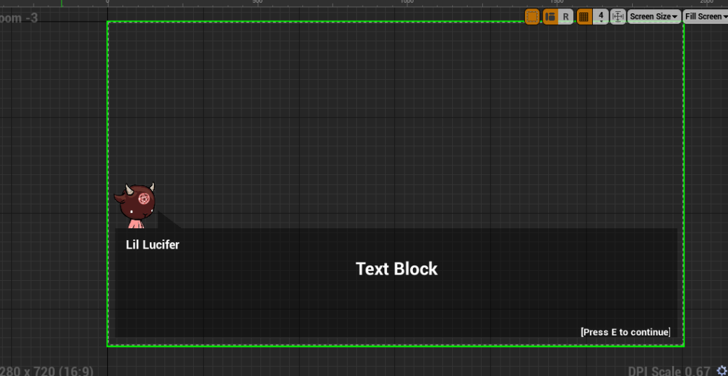
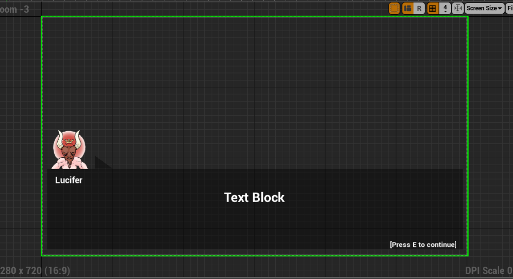
GUI
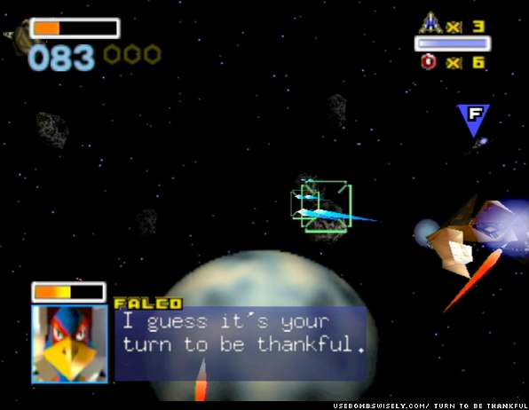
On my producer’s advice, I began by researching dialogue-centric GUIs of classic games.
Banjo Kazooie
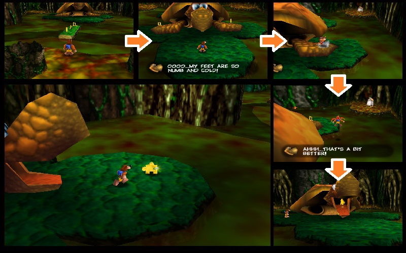
Like most games, the dialogue in Banjo Kazooie is triggered by in-game events. Primary dialogue is displayed in a semi-opaque widget at the bottom of the screen with an icon representing the speaker. In some scenes (especially those featuring conversation between two characters), the widget is displayed at the top of the screen instead.
Spyro
Following in the vein of 3D dialogue-heavy games before it, Spyro too uses the traditional GUI widget at the bottom of its screen to display its dialogue. An interesting note to make here is that the design is consistent with the rest of the graphical user interface, such as its pause menu and the small onscreen widgets that display score count and such. Speakers are identified by name in a small ‘tab’ like area above the dialogue widget.
Super Mario 64
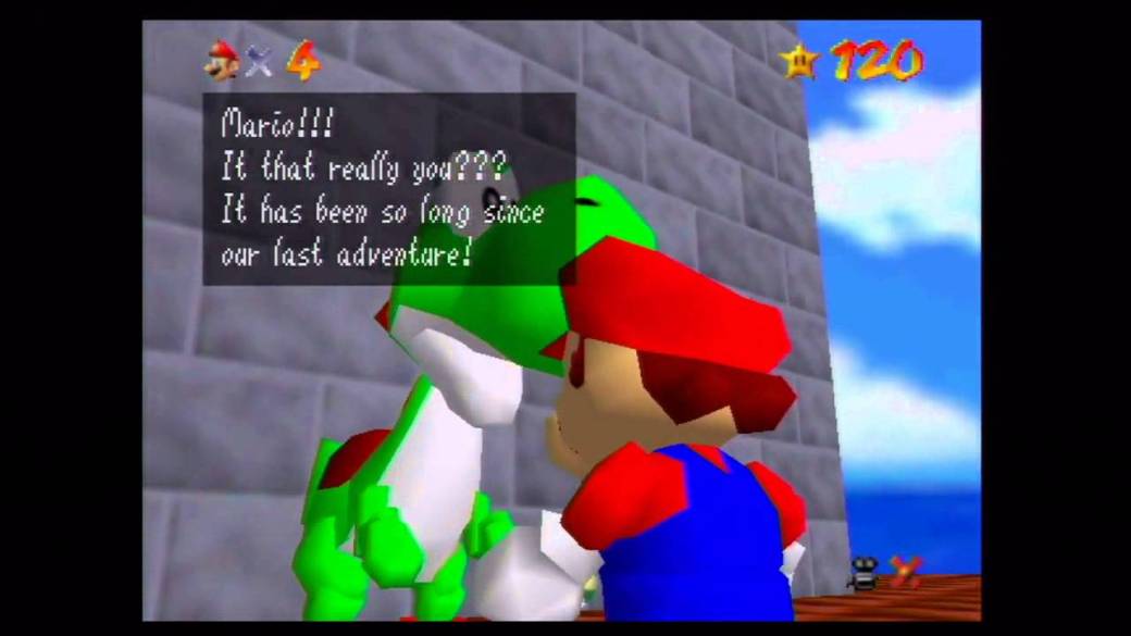
Immediately, the flaws of this widget design are apparent compared to the previous two games. However, like the two previous games Super Mario 64 uses a semi-opaque widget overlay on the player’s viewport. The overlay is positioned in the main viewport area, obscuring action and creating more visual ‘noise’ beneath the semi-opaque widget (making it more difficult to focus on the words). The text is far smaller and thinner than the previous examples, again making it more difficult to comprehend. The text’s design is inconsistent with other onscreen widgets and visual design (which are otherwise blocky and colourful).
Take-home Notes
- Consistently, dialogue widgets are presented at the bottom of the screen.
- They are themed consistently to match with the rest of the GUI components.
- The widget window is a semi-opaque black colour, sometimes rounded for softness or kept straight for visual effect.
- Speakers should be identified by name or by icon.
- Onscreen widgets should not take up the entire space of the screen – rather, it should be presented as an overlay with an area smaller than the screen.
- Text design should be user-friendly.